February 28, 2014
We’ve been in this house for 4+ years now, although a few weeks ago I told someone it had been 5, because it feels like 5 to me. My motivation to DIY every nook and cranny of this home, and make it perfectly decorated goes in very short and sporadic spurts. In the past 8 years, we’ve had 3 children, started a business, started and quit 2 different jobs, and DIY’d 3 homes in the process. I think it’s only normal and perfectly acceptable that my gumption to hang pictures and paint walls has in many ways, been hung out to dry.
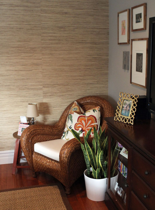
But the last month or so, initially spurred on by our holiday party, I’ve had the motivation to add a few touches here and there to our home, to try to get it to the place I’d like it to be. I love our home and truly think it has a lot of character and charm to it, but little things have bothered me, like outdated photos hung in frames, or completely empty frames! So I’ve been tackling the little tasks that seem mundane and well, quite small, but help to make the inhabitants of a home actually feel at home. A sweet smelling candle, artwork, a cozy throw. The kind of things that don’t really jump out to a visitor, but mean everything to the home owner.
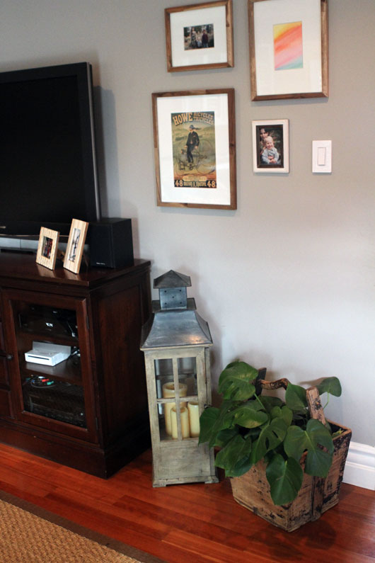
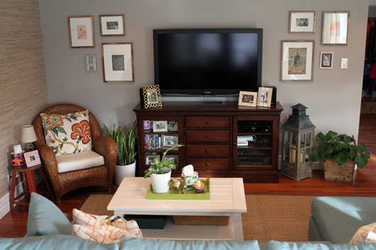
I’ll share the projects I’ve completed, or at least semi-completed, in the next couple of weeks, but first wanted to start with the family room area. I actually blogged about the start of our gallery wall almost 1 year ago, and for almost a year, the frames sat empty because I felt too overwhelmed with the simple task of sorting, choosing, and printing up photos. Can you believe that craziness? At any rate, all it seemed to take was an adult soiree to get me in gear, so I finally filled the frames.
In all my hours spent studying gallery walls, I’ve discovered that this isn’t really one, or rather, not the kind of gallery wall I’ve come to love, with an eclectic mix of well chosen art and vintage frames, placed in almost haphazard fashion. If you were to think of a person’s gallery wall arrangement as a litmus test, this particular picture frame arrangement would definitely classify me as a bit controlling and maybe even uptight. I’ve come to terms with that, and have a plan on how to let loose a little more, by adding in a hodge podge of frames to fill in the empty crevices. This wall therefore, remains a work in progress. But at least the frames are no longer empty.
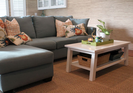
I also finally got rid of the very old and beat up pleather ottoman we had, and got this white table from West Elm. I don’t love it, but it was on sale and I like that it has a bottom tier shelf to hold books and a blanket. I really went back and forth on it, because I felt it was too bright white for this otherwise muted space, but eventually I plan to paint the media console anyhow, and add in some other art on that big wall that will add another level of brightness to the room. The white pots were also thrown in to help level out the beige tones and throw in more white. For now though, it is at least pretty and functional.
When I finally went through photos and chose a selection to print up, I also decided to update our existing picture frames with shades of beige, bronze and gold. Our old ones were from KMart and were literally falling apart, with broken glass and stands which no longer worked. These are all from Target and are either Threshold or Nate Berkus.
I know this is small potatoes for some of you, but for me, these little updates are a lot for me. Home decor is definitely not my forte, and even these small changes felt like like work, not enjoyable really. The end product is wonderful, but the decisions along the way are stupidly painful for me.
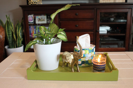 You may notice the cute little pops of colorful design added in by the boxes of Kleenex tissue. When I was at Alt, I met up with the Kleenex team and learned about their recent partnership with iconic designer Isaac Mizrahi to bring four new and unique designs to the Kleenex Expressions line. I truly loved the resulting look of this brand collaboration, and am honored to have been chosen as a Style Ambassador for the next two months, to help spread the word about this partnership and Kleenex celebrating its 90th anniversary. You can visit the Kleenex Style Studio to look at all the designs, and choose the right one to complement your home.
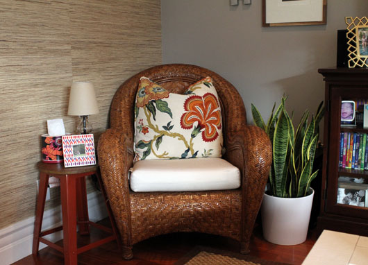
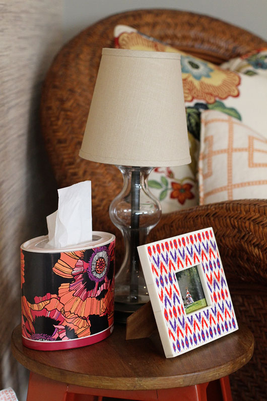
It’s cold and flu season and we are constantly reaching for Kleenex in this house. We usually keep a box in each central location of the home, and having these cute designs, which so seamlessly work into the existing decor of the home, is just a neat little added bonus. It’s the little things after all. I definitely don’t feel like I have to hide the box of Kleenex when guests come over.
Kleenex is hosting a sweepstakes in their Style Studio called “Catwalk or Kleenex?” where you’ll be asked to name the design and whether it’s from the catwalk or the Kleenex line. Take the quiz and automatically be entered to win an all-expense paid trip for two to New York City to find your Kleenex brand style with a famous designer. The winner will also receive $5,000 spending money to use on a NYC shopping spree. The sweepstakes runs through March 7th, so hurry and enter!
I’ll share the entry way that’s almost complete in the next few days, as well as the most amazing frames I discovered. Have a good weekend everyone!
This is a sponsored post by Kleenex Brand. However, all opinions expressed are my own. As always, thanks for supporting the brands, who help to support this site.

















Now I want to go shopping for Kleenex.