March 10, 2013
 This past week something quite awesome happened, in terms of ideas coming together for some unfinished parts of the house. I finally had a few light bulb moments where it became pretty solidified what I’d like to do to complete certain rooms. I’ve been agonizing over making decisions and figuring out what to DIY, what to buy, what to save and what to throw away and it finally all clicked. In large part it’s from taking 3+ years to mull things over. If me making decisions on our house were a race, I’d certainly come in dead last.
The other part that’s helped me figure things out, I’m sad to say, is by spending a lot of time online browsing Pinterest. I’ve recently started taking more of an interest in Pinterest. In the first 2+ years I’d been using it, I’d pinned about 600 items. In the last month I’ve pinned over 300. I can really say that the time has been very well spent, and my family is seeing the benefits by an increase in our meal variety. But by spending less time creating projects for this blog, which has admittedly hurt my traffic a smidge, I’ve allowed myself the time to spend hours browsing and pinning and asking myself questions and being inspired. I now know exactly what I need to do to finish off the family room, and to create the “landing zone” area in the entryway that I’ve been talking and dreaming about for almost 2 years; an area where hats can be hung and backpacks could be thrown in an orderly way. More on that later though. For today I want to share with you the progress we made on plotting out the gallery wall.
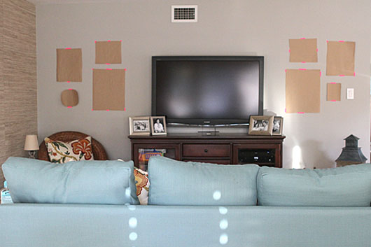
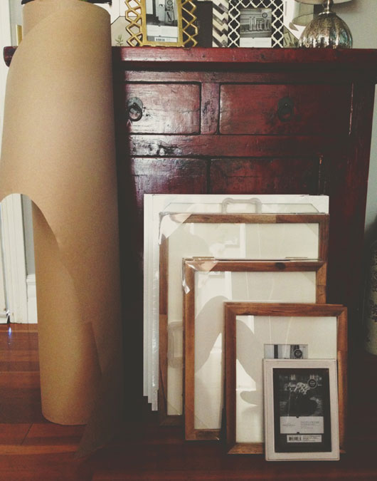
I mentioned on Friday that I had spent some time buying several frames last week. When we’ve created a wall of pictures in the past, we’ve always laid them on the ground, measured and plotted, and then hung the frames. But the arrangement never looked quite the same or how we wanted it, mainly because we were envisioning something on the floor versus actually hanging on the wall. But it occurred to me last night that what I should really be doing is hanging faux frames on the wall in the arrangement I wanted, so that I could easily move the puzzle pieces around until it fit just right. So I traced the frames I had purchased onto some Kraft paper, cut them out, and then started arranging my layout.
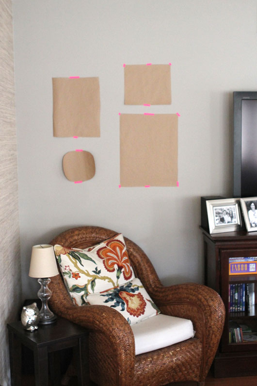
By seeing it actually hung on the wall, I could see where the holes were and where I needed to add or move pieces around. With just a bit more pre-planning upfront, I’ve now saved myself lots of time moving frames around after they’re hung, and dealing with patching and touching up paint. Right now the arrangement is very asymmetrical and once the actual frames are up we may want to add a few more filler pieces, but I’m thinking that since the space on either side of the TV is so small, simpler is better. I’ll save my more adventurous ideas for a larger wall.
So now to fill the frames. That was the other part that really intimidated me; what to put in them? When we’ve created gallery walls before I never really loved them and I now know what was missing. Art and prints and mementos hung along side pictures of the family. So between Etsy and some DIY ideas, and a box of family mementos I’ve been saving; ticket stubs, boarding passes, kid’s artwork, I’ll finally be able to create the eclectic mix that I’ve been dreaming of.
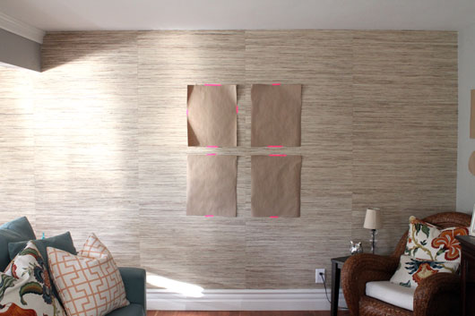
The wall with the 4 frame arrangement will house an Instagram project I’m working on. Below those frames I’m placing a small bench that used to be in our bedroom, but now will be recovered in a coordinating yet contrasting fabric. Other plans for the family room include a new coffee table to replace the 9 year old fake leather ottoman that’s literally peeling, a couple of round baskets to hold the toys of our newest family member, and a couple of more fun pillows to offset the very pretty floral fabric. I’m thinking of bold and even graphics with a saying or two. I love these hustling pillows but think they may be a bit too bold. I have a vision overall, and it’s finally very clear. The frames I’ll be using in this room, by the way, are a mix of Target and Ikea frames. I originally bought the wood ones for the grasscloth wall but later realized it would blend in together way too much.
 So the progress made in the last week may not seem like much. But to me it feels like a big, silly weight has been lifted off my shoulder. My friend Darlene writes about overcoming Design Paralysis and I guess I’ve been sick with a good case of it for a while now. But I finally feel semi-cured and I’m ready to get ‘er done so we can enjoy. It’s funny, but even with just the Kraft paper hung up there with that neon tape, it looks more interesting and fun in there than before. Imagine what it will be once we add the frames and photos? So do you guys ever suffer from design paralysis, and if so, how do you overcome it?
And don’t forget that the hashtag for March is #52weekstocreatemar and the prize is $100 in craft supplies, a round up of my favorite items at the moment. Post to IG any photos you take of creating in March; including cooking, decorating, crafting and organizing. Regram this photo for extra entries, and follow along with my creating adventures @fourflights.
















i like it a lot! we have the same setup with our tv taking up the width of the table it is set on, and i wasn’t sure how to fill up the space around it.
where did you get your kraft paper from?
thanks!
From Paper Mart. it’s local to me but they have an online shop as well and they’re super affordable!
Awesome! We have pictures all around our (similarly situated) TV. Can’t wait to watch as you fill it up.
I’m wondering if we should add some smaller frames up above the TV as well. Do you have some above or just on the sides? I have a hard time determining when too much is too much?
Above too, but I think our TV is lower and ceilings might be higher. (Old house so they are not a standard height but I think are about 9-1/2 feet.) If I can get a picture showing the whole thing I’ll email it to you. Not that I’m a great standard – I just keep hanging things till they look OK to me. Then I move them around when I get bored. 🙂
Just sent you a phone picture. AS I said in the email, nothing like a picture to make me see all the flaws in the arrangement and the shelves. 🙂
I can’t wait to see your results!! Where did you get the great wall-covering? -Did I miss it in the post?
Thank you SO much for the link love. I am learning SO much on my break from FB, but one of the top things: You Lemonade Girls are special to me! MISS YOU!
WISH WISH WISH you were going to Blissdom. You know you want to change your mind….
I so need the entryway inspiration! can’t wait to see what you came up with for that. 3 kids = craploads of stuff going in/out every day